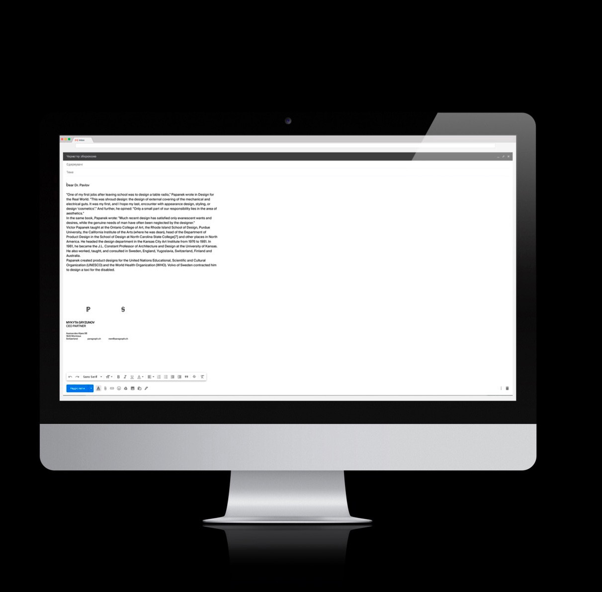
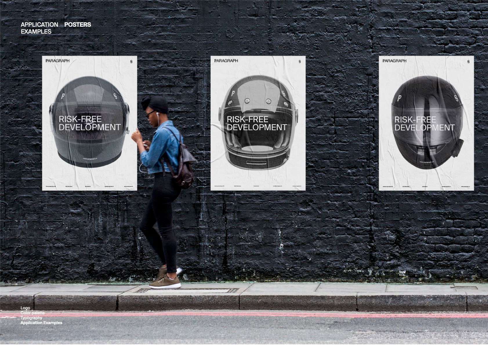
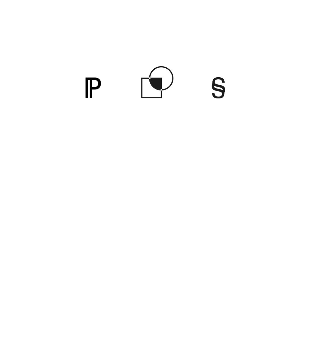
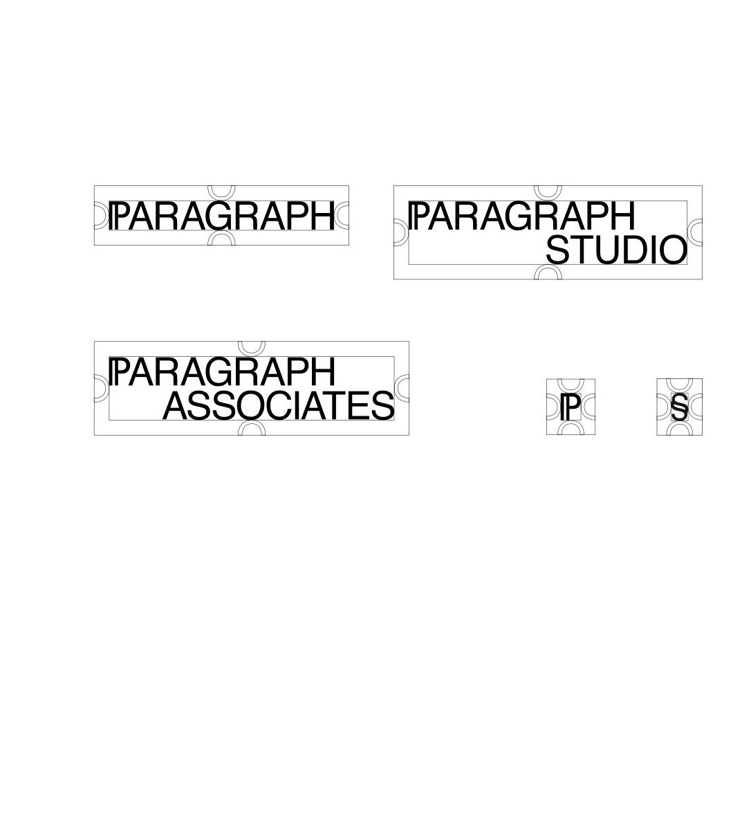
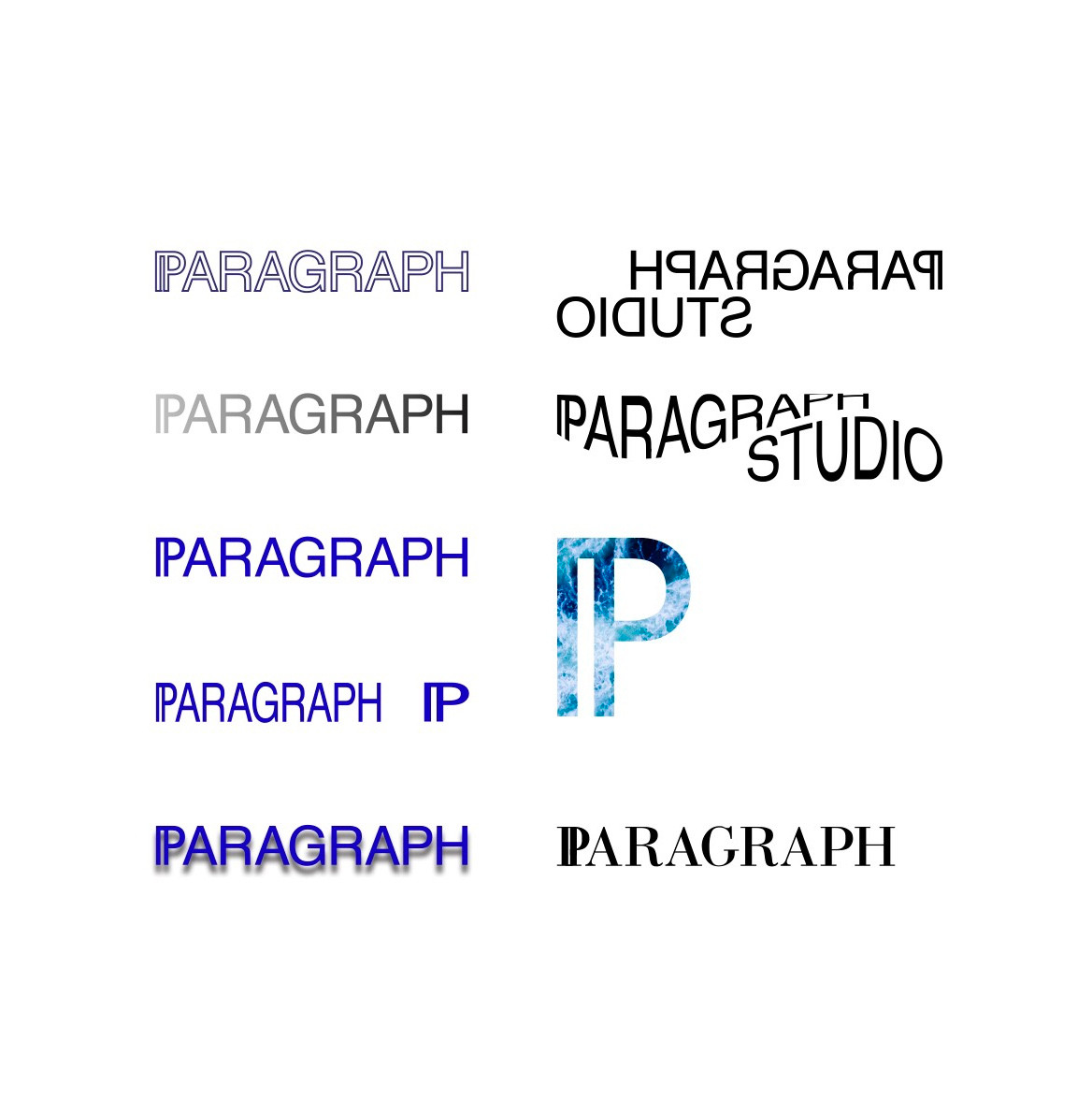
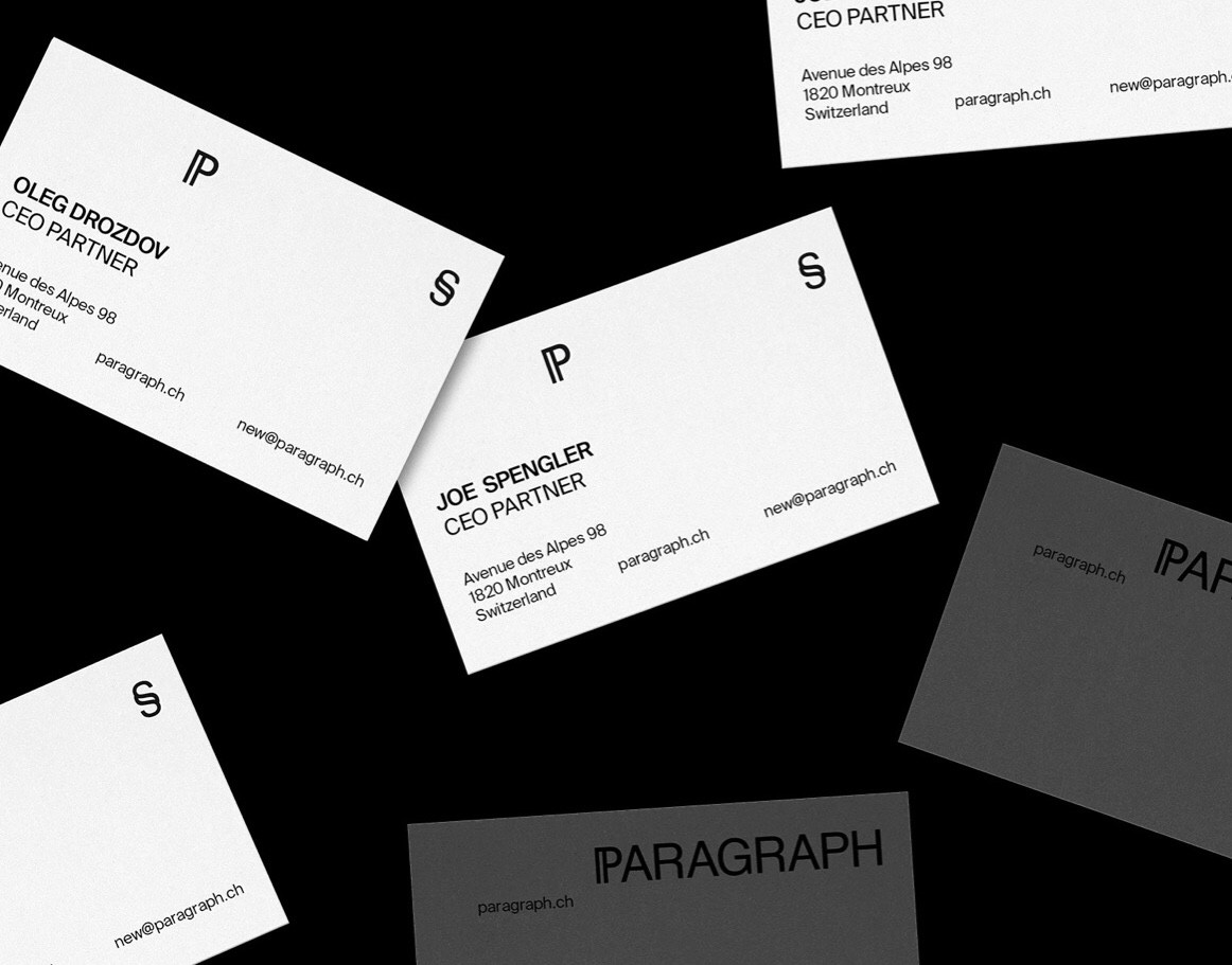
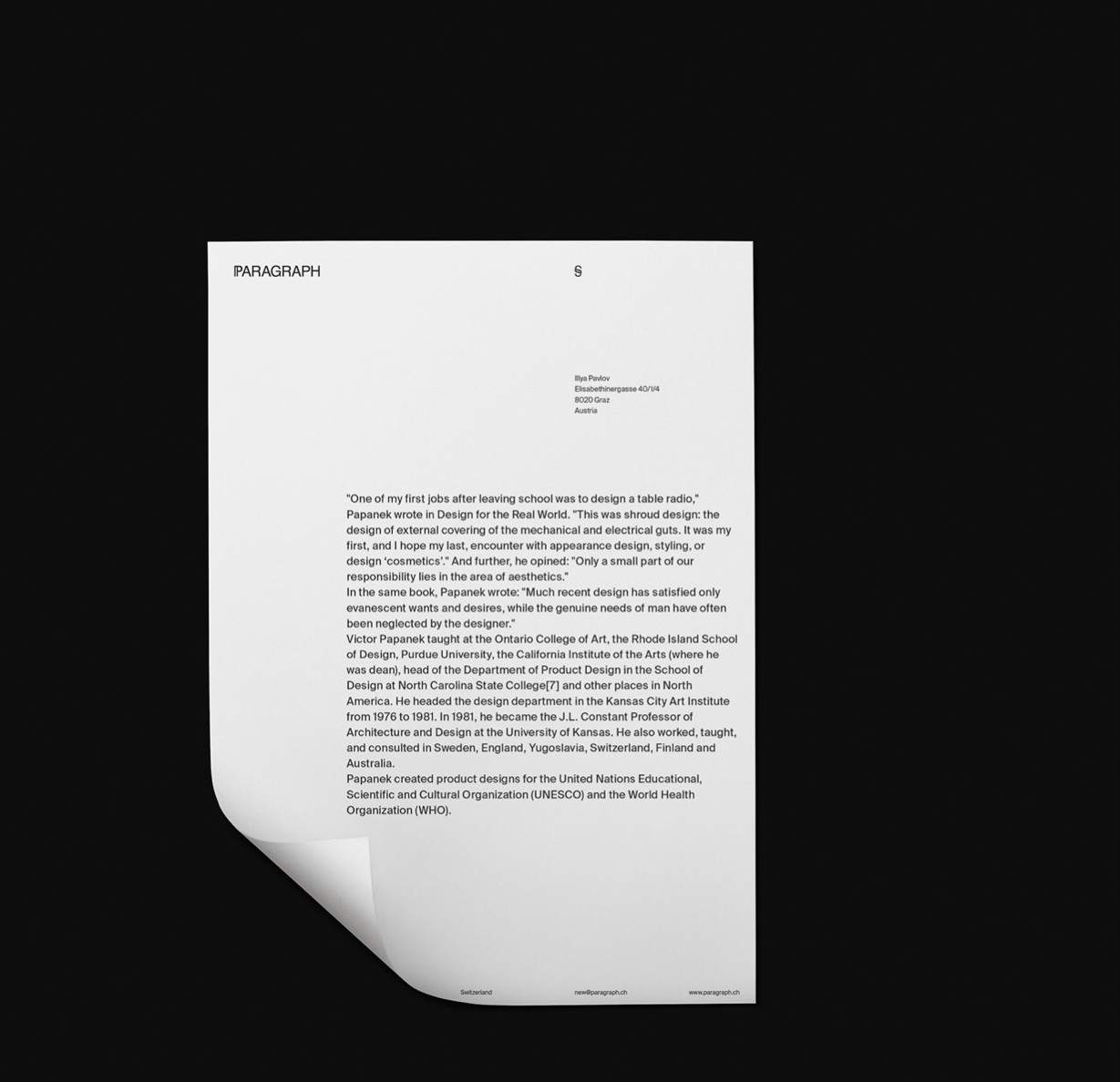
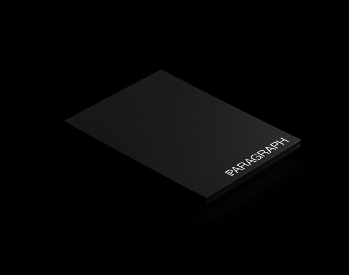
PARAGRAPH
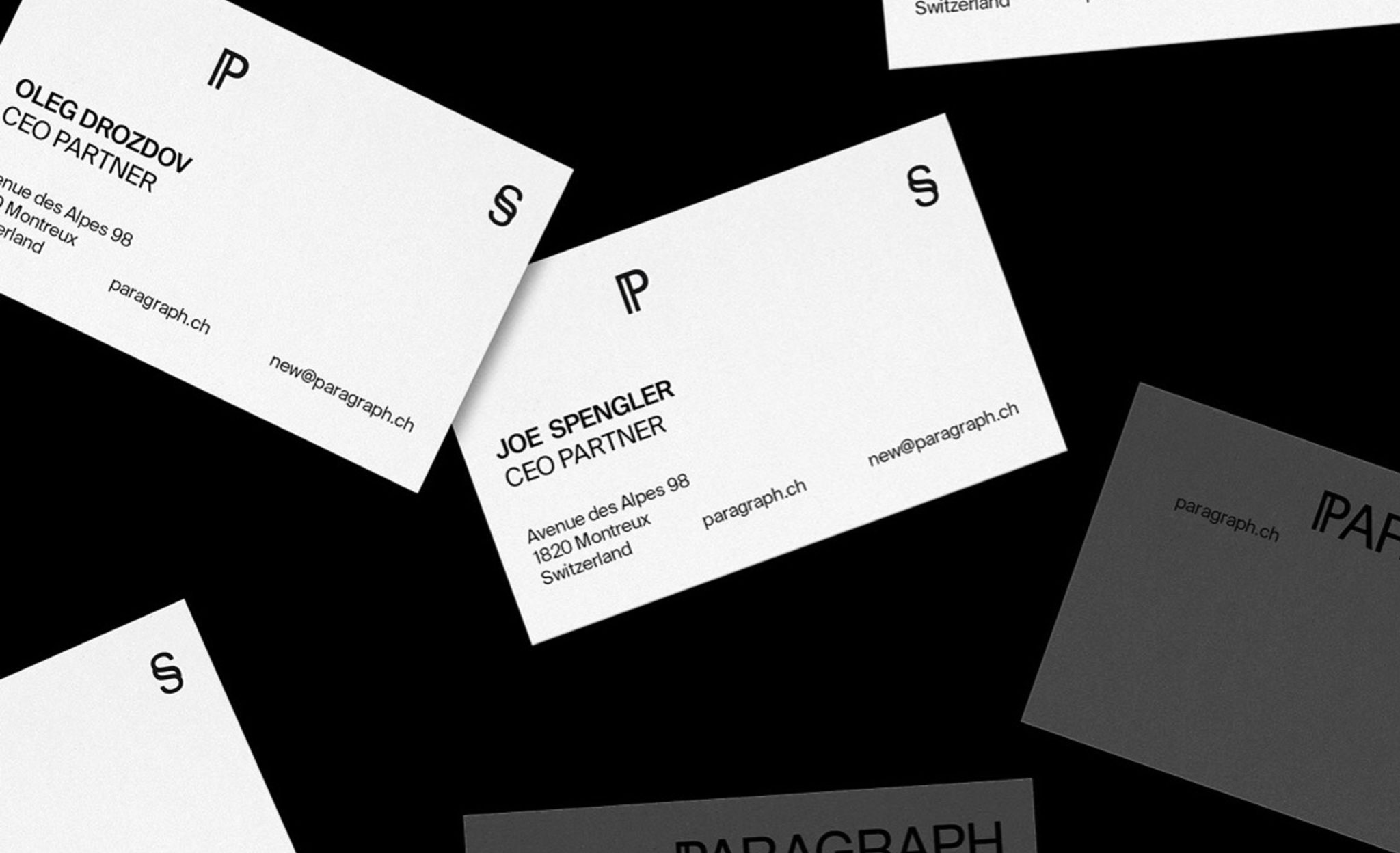
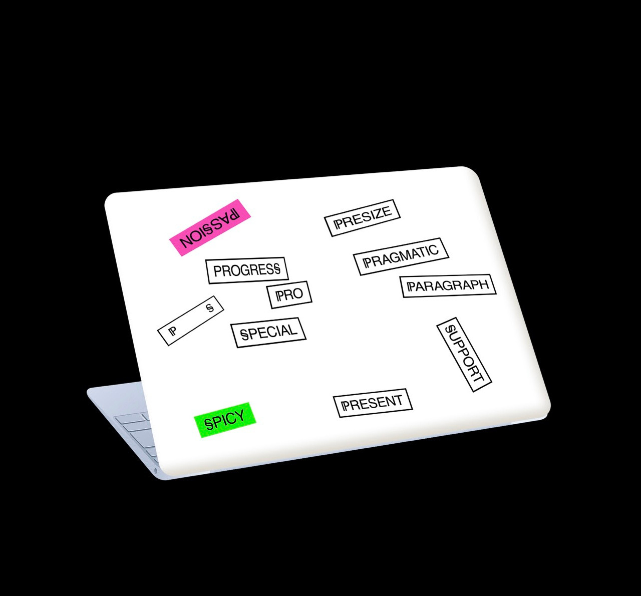
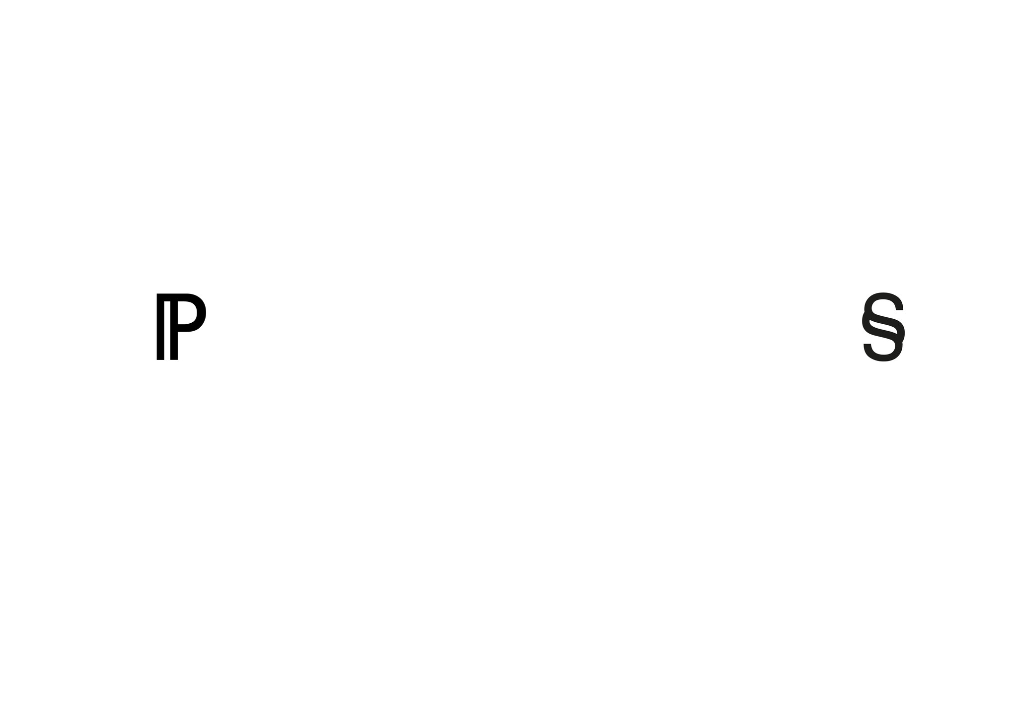
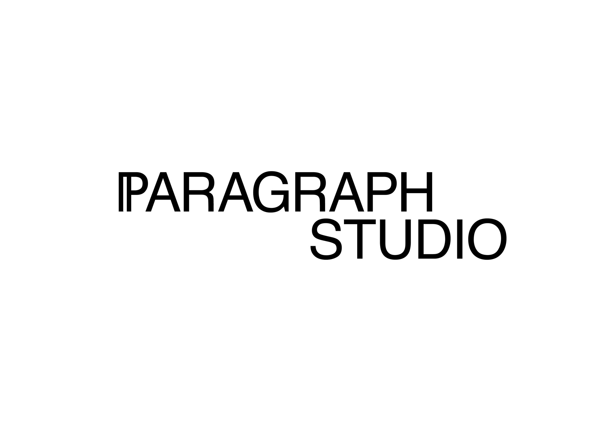
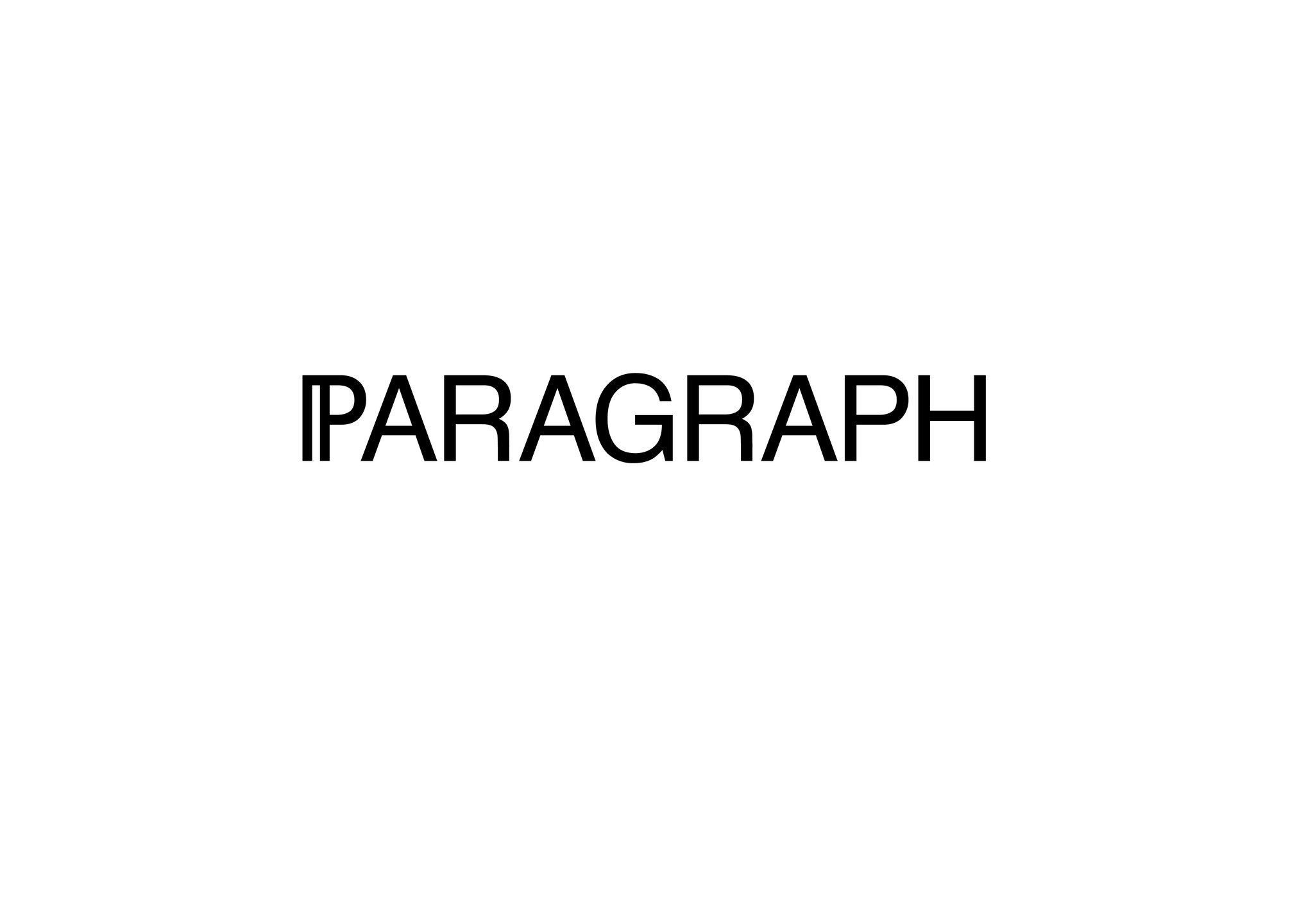
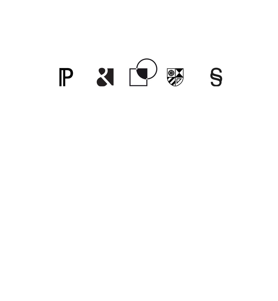
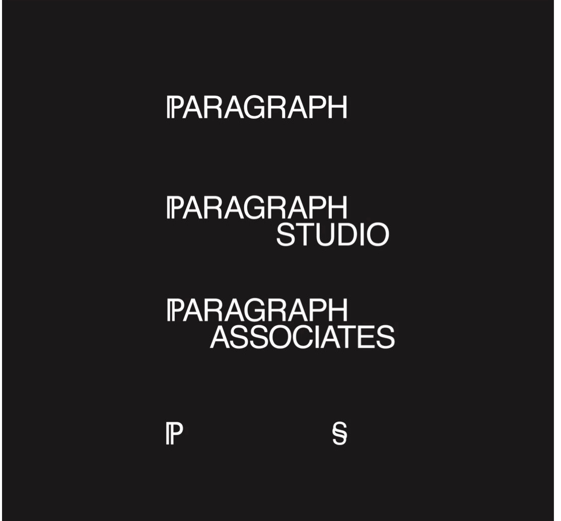
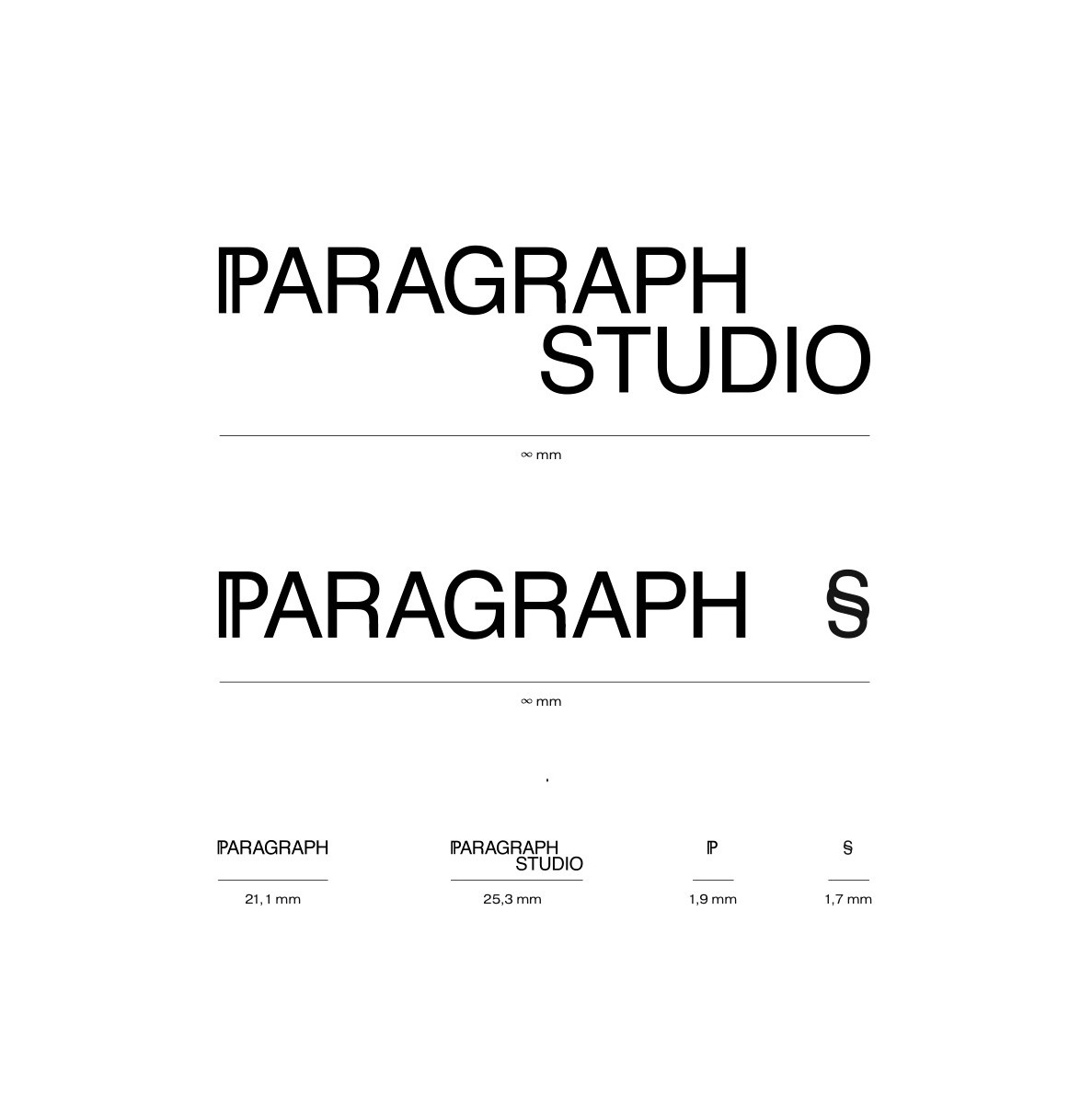
As a basis for wordmark’s typeface a good old, time proven Helvetica was taken. The font was modified to make letters fit the sequence in the word and look more harmoniously. The font is rendered in a balance between boldness and elegance the way that it’s legible and visible at the same time. The main hero of the logomark is the capital P letter with a double stem, which stands for a drop of international sparkle in Swiss restrained character. Also it’s a paraphrase of a classic new paragraph sign - pilcrow, which is associated with a new chapter or a new story beginning. Paragraph wordmark could be followed by a descriptor. This could be Studio or Associates. These words are positioned with a light shift relatively to Paragraph wordmark. This adds a bit of democratic approach feeling.As an emblem of the company we use two symbols, which are associated with a new paragraph in grammar. They are pilcrow and silcrow signs. The rhyme between each other nicely because of double strokes they both have, yet they embody different characters which complement each other. Also this tandem could be associated with ¶aragraph §tudio or ¶aragraph A§ociates word pairings.
Logos of partners, collaborating on the projects could be housed in between P and S signs. This composition communicates an idea of an open and collaborative spirit of the company.