L&S
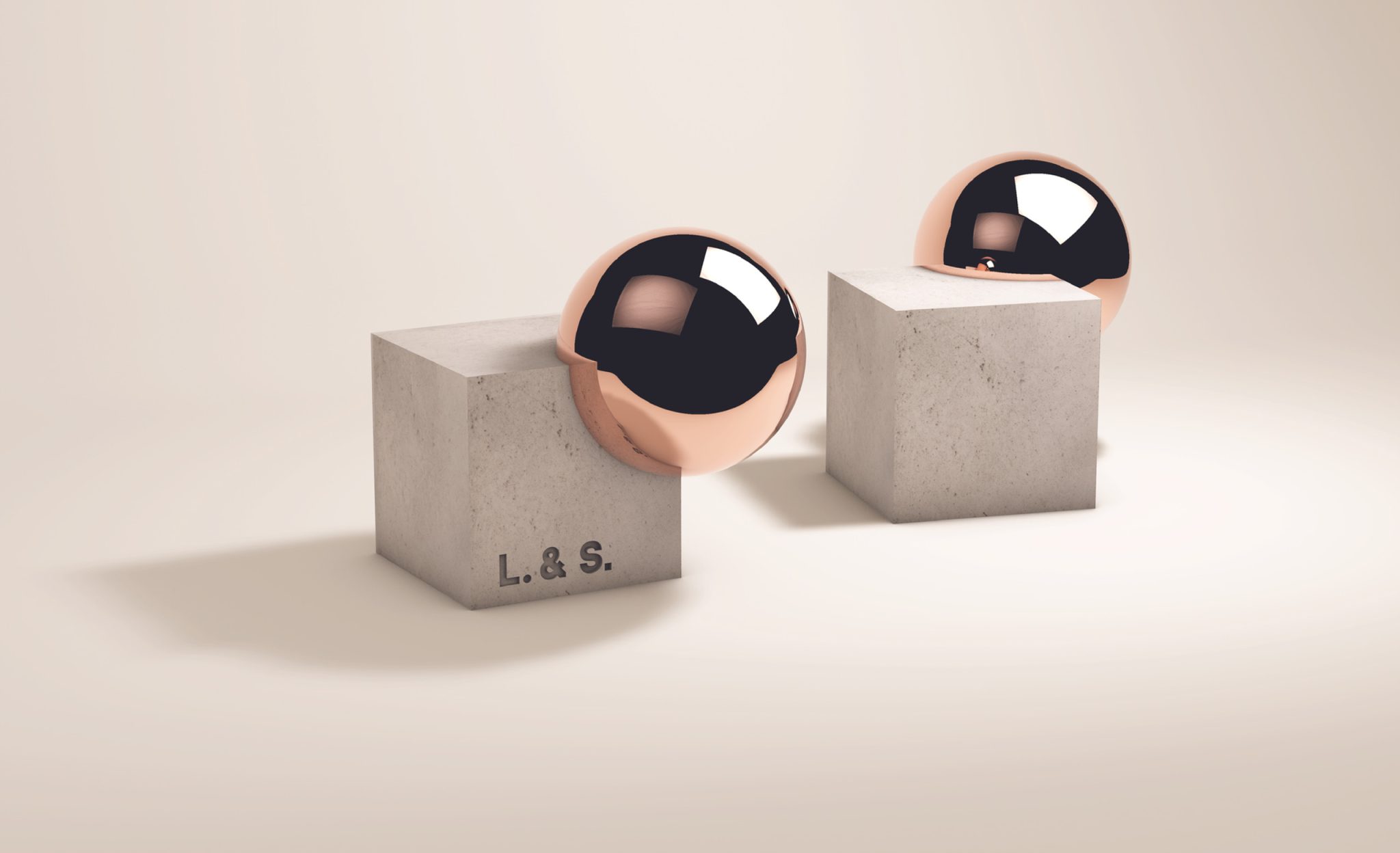
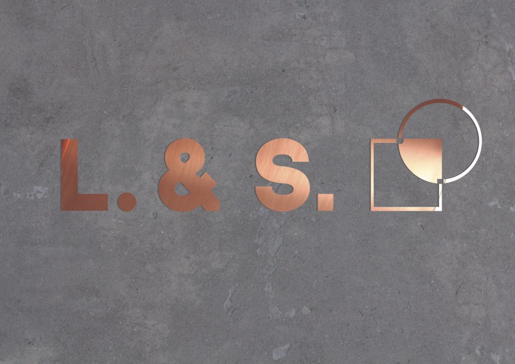
L&S logo concept represents coexistence of two contradictions - square and circle. They are embodied in L&S letters itself as well as the dots, which follow the letters. According to principle of harmony round dot belongs to square letter L and square dot belongs to roundish letter S. L&S icon represents the concept of a fruitful cooperation between two different characters. Square and circle overlay to create common space which stands for new power gained by their synergy. Also in the overlap of contours you can find small copies of circle and square which are there to show attention for details.

