What is a monochromatic colour scheme
Monochromatic combinations are the easiest way to achieve harmony in interior design and decoration. It is based on the colour balance in decorating, shading and varying tones of the same colour.

What is monochromatic color scheme?
Monochromatic color scheme definition: a combination of multiple shades of the same colour in the interior. The play of halftones creates the necessary depth and volume, and the design becomes expressive. Bright hues are ‘turned on’ carefully, trying to keep the solid colour to a minimum by adding accents.
How do you build interiors on the nuances and gradations of tone?
Knowing the principles of using one colour for an interior designer can create a balanced and stylish design.

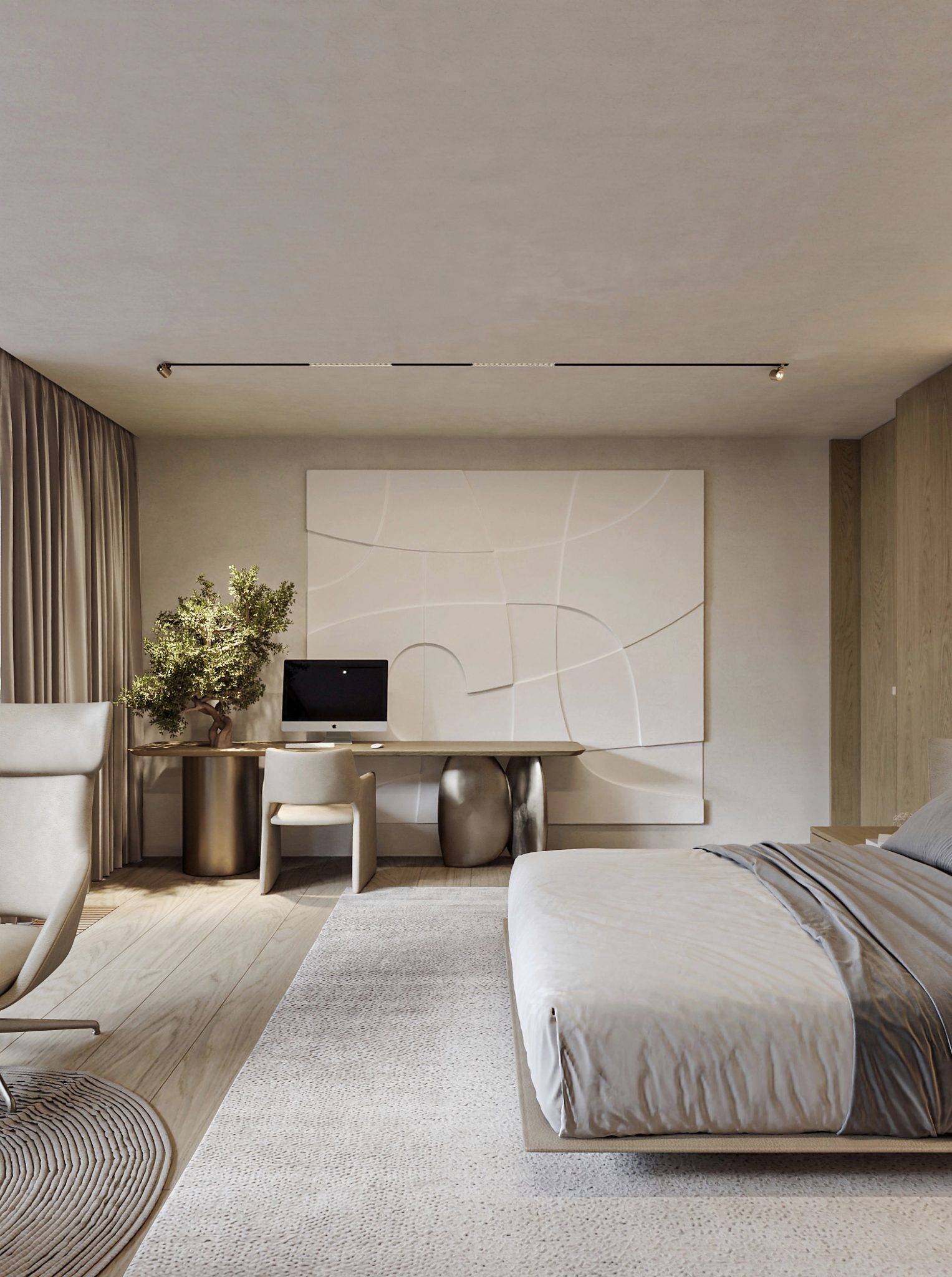
A monochrome interior is dominated by one colour. The presence of a second contrasting shade is kept to a minimum. To avoid making the interior plain, it is necessary to use the entire palette of shades of the dominant colour.
Choosing a monochromatic color scheme is a good beginning. However, in this case, the use of different textures is mandatory. Just one colour can be perceived completely differently on different textures. These can be the most daring combinations, such as glossy and matt surfaces, textiles and fur, wood and metal. Various patterns and embossing add texture. Volumetric elements on the background of smooth surfaces look original. 3D panels, decorative plaster and fragments of brickwork are used for this purpose.
A monochrome interior requires thoughtful lighting. Customised and sophisticated lighting can change any design. Modern luminaires make it possible to achieve different effects, highlight areas and add shades to the interior by using multi-coloured LED lamps.

To create a monochrome interior, you need to have an idea of the colour you want to use and the proper distribution of roles for the shades of that colour.
You need to understand what kind of decoration you want to see in your home. Will it be an interior of light or dark tones? All pastel colours are considered tranquil colours. They are comfortable and cozy living among them; they do not cause antagonism. Homogeneous light interiors are perfect for rooms with insufficient light. They create a gentle and airy atmosphere.
What colors are in a monochromatic color scheme?
White, beige, grey or dark brown colour schemes are usually favoured. They look restrained and always topical. They are also easier to match shades and maintain balance. Shades of blue, green and purple are used less frequently, but the interiors look bright and striking.
The psychology of colour suggests that neutral monochrome colours in interiors are chosen by people who seek nature, naturalness, tranquillity, cosiness and stability. And decorations dominated by rich and vibrant colours are the choice of creative and extravagant people.
At the same time, there is nothing boring about neutral colours. If you follow a number of simple rules, you will get a really effective, harmonious and stylish space.

Very attractive are saturated colours – black, green or blue. In order to soften the harshness of the dark interior, it is enough to add accessories and decor elements of neutral shades. A white carpet, for example, can make a room feel lighter and more welcoming.
When creating a monochrome interior design, mix no more than five shades and make them repeat in different areas of the room. While staying within this palette, play with textures – the same colour is perceived differently on a smooth and textured surface. The easiest way to start from the colour of the wallpaper or patterned textiles is to pair them with a single colour surface.
Neutral monochrome colours, like other colours, can present space in a way that works for you. The same rules apply here as to ordinary colours. Simply, when using monochrome colours in an interior, you have to operate with the concepts of dark – light, warm – cool.
Mix different textures. Such a combination will help to avoid monotony, and furnishings will not visually merge with each other. For example, give preference to glossy furniture surfaces, but don’t forget to add a soft fluffy carpet or textiles made of natural materials. The closeness of tones, but the difference of textures, gives the interior an artistic expression and makes it more detailed.
Select books and accessories in similar shades. Book covers can be wrapped in matching paper or even fabric if necessary. The same principle works with other decor and accessories.
With the right combination of shades, the monochrome range will be appropriate in any interior style – from classic to contemporaneous. The choice of the dominant colour leaves room for experimentation and allows you to create a very extravagant interior.
Those who choose monochrome interiors, first of all, seek to reduce the visual noise. Monochrome interiors are one opportunity to surround yourself with your favourite colour. By selecting shades, you can reveal the power of the chosen colour and see the richness of the halftones.

What colour to choose? Monochromatic colors examples
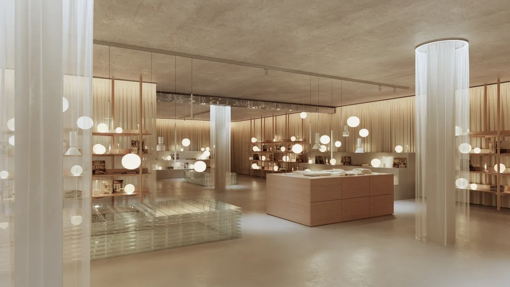
White is a perfect colour to adjust a room visually. It can add volume and push the boundaries of a room apart. Designers appreciate these properties, which is why white is often used to decorate small flats. Its neutrality does not overwhelm the interior, it is concise and elegant. As well as is black and white monochromatic interior.
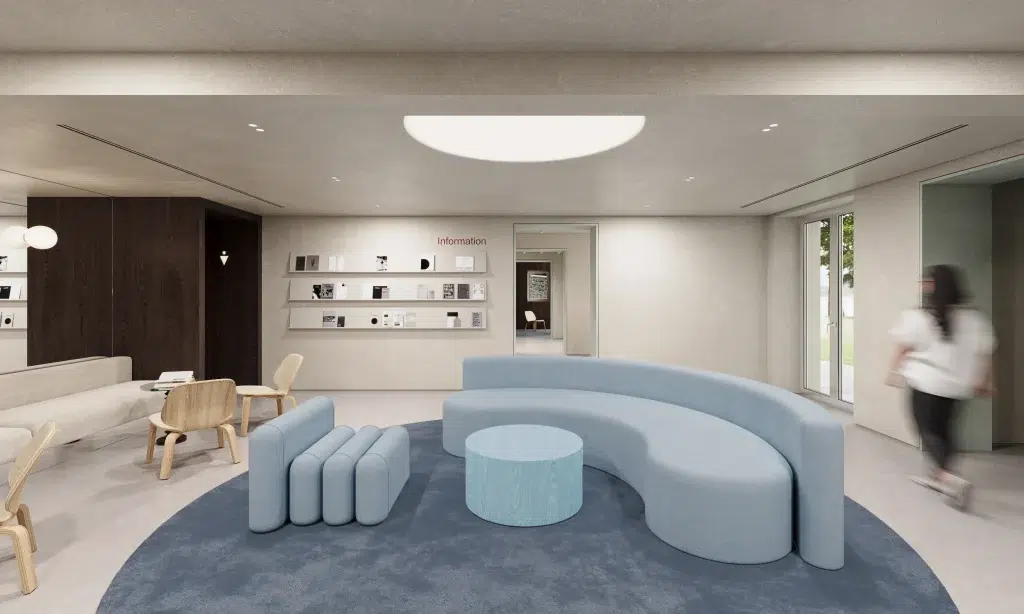
Grey has a rich palette of half-tones and is used extensively for monochrome interiors. This calm shade is perfect for living rooms. Grey is often used in such trends as Scandinavian style, industrial, loft and high-tech. It blends well with other colours, so you can easily find accent details. Classic monochrome grey is an elegant, noble and concise interior. A rich palette of shades allows you to create unique and very subtle combinations. The timeless companions of grey are expensive fabrics, metal and marble.

Bright monochrome interiors can create a cheerful mood throughout your home. Try designing a room in shades of green. This is one of the few colours that can be used in interiors in large quantities. The green monochromatic color scheme is a rich mix of shades such as bog, bottle glass, mint, moss and fresh leaves. This makes for a very versatile and beautifully coloured interior.
Green also looks great on contrasting textures. Mixing rough plaster with velvet decor and glossy glass surfaces with matte textures, you get a trendy and original interior.
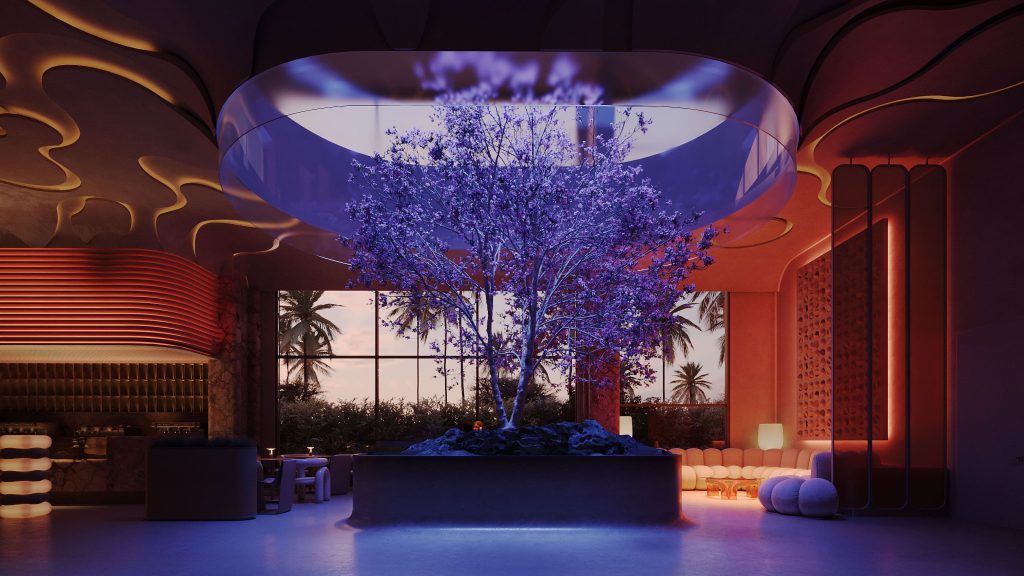
The purple monochromatic color scheme looks gorgeous. This deep colour is considered to be cold and not everyone dares to use it. To soften the effect, the interior is decorated with accent lighting in shades of light. Purple is also popular in Art Nouveau, Pop Art and Art Deco styles.
Yellow is associated with sunlight. It is very warm, atmospheric and cheerful. The monochromatic yellow color scheme is perfect for the bedroom: it’s easy to wake up in this room, as if illuminated from within by a soft light.

The red monochromatic color scheme is rarely used as a dominant colour in interiors. However, if it is dark burgundy or muted shades, the colour is quite acceptable. Properly created decor in red will improve the mood, cheer up and refresh the room. Combines well with grey, white, gold, brown, and blue.
A few examples of how colour affects the perception of a room:
A small room with a high ceiling – to correct this, it is sufficient to make the ceiling and floor dark and the walls light. The ceiling and floor will visually get closer to each other, while the walls will visually expand accordingly.
A long, narrow room can be made visually wider by making the walls on the long side light and the walls on the short side darker. In combination with a lighter floor and ceiling, the effect is maximum. If you do the same with a square room, you can make it visually rectangular. It is also essential to find the right lighting, highlighting the areas that need to be emphasized and darkening those that are desirable to hide.
A large room – if you want to make a large free room cosier, simply execute the walls and floor in dark, warm colours, and leave the ceiling in light. The room will seem smaller than it actually is. A variety of dark textured panels on the walls and carpets on the floors are good ways of narrowing and structuring a large room.