How to decorate the interior of your home in cream colors?
- The psychology of color
- Popular cream colors. Names and descriptions
- Colors that go well with cream
- Choice of lighting
- Rules for the use of cream in the different styles
Cream-coloured interiors are popular. But it seems tedious and challenging to create such an interior. Yes, it’s easier to paint a wall in a bright color and put on trendy furniture. Indeed, building an eye-catching interior in cream colors is a challenge that only a few designers can meet. For those willing to take a risk with Craft & Concept, we guide you on how to work with neutral tones.

The psychology of color
Cream and beige are considered the calmest shades in the color palette. People perceive them positively and can maximise the nervous system’s relaxation after a hard day’s work. For many, a house in beige tones is associated with cosiness and an atmosphere of tranquillity.
People with a wealth of creativity and vitality frequently choose cream color living room designs. At the same time, some homeowners find this kind of design too casual and monotonous. But if the interior is diluted with a bright background and filled with contrasts, the room will become a natural paradise, where you can fully relax and de-stress with a cup of coffee.
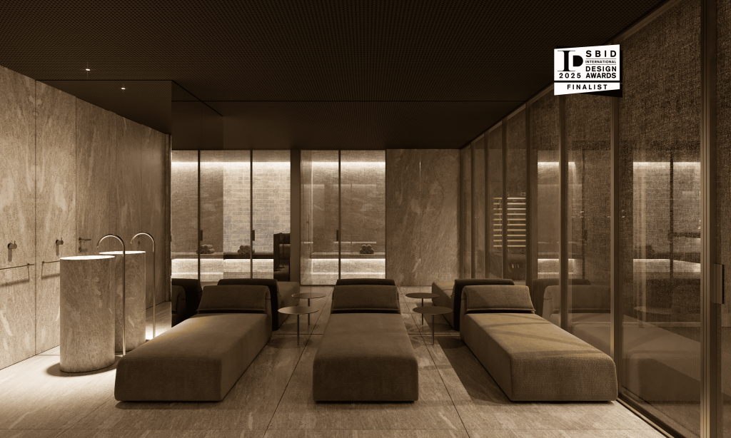
In addition, the chocolate, beige, and creamy colors interior create an aristocratic feel to it. That is why this design is preferred by people who love everything expensive and exclusive.

Popular cream colors. Names and descriptions
Cappuccino, caramel, milk, chocolate and sand tones are the most common colors in the design.

The cappuccino shade lies between brown and beige on the color chart. It radiates the warmth of the home, reminiscent of a cup of delicious coffee and cake. In interiors with colored glossy surfaces, it adds light.
Caramel is a very warm brown shade, sometimes with flecks of red. It is a ‘candy’, slightly frivolous, gentle and cosy atmosphere.
Milk is often compared to white but is softer and warmer. Depending on the details, it can be relaxing or invigorating without being irritating or annoying, even if there is much of it. For many, the color milk evokes trust and love, feelings of comfort and security, and pleasant care.
Chocolate is inextricably linked to earthiness and reliability. It relieves stress and fatigue, eases conflicts and looks solid. As a rule, it is chosen by people who know how to achieve their goals.
Sandy creates a calm, friendly, cosy atmosphere and can have understated or glamorous overtones. It has the power to set you in any mood.
Colors that go well with cream
The creamy colors are compatible with all colours in the interior.
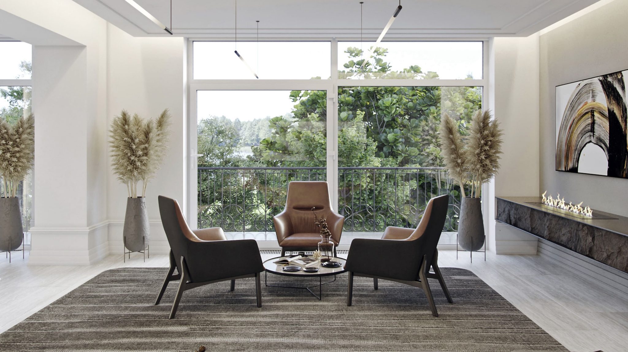
Cream with chocolate. Radiates peace, confidence and elegance. Cappuccino can look soft or stand out against cream, bitter or milk chocolate. The effect will depend on the balance of tones, the room’s size and the furnishings’ design. Cream and brown in interiors are attractive because of their dimensionality and lightness.

White and cream decor …does white and cream paint go together? Initially, it might seem that these tones can merge. However, white and cream furniture creates the impression of gradient color transitions. This combination of colors is used to develop Scandi-style interiors.
Cream and white living room:

Cream and grey. Such a duo is suitable for smooth transitions, combined with furniture and decorations made of natural wood. But the tone of the main shade is still cream and grey. What color furniture goes with cream walls? – Grey.

Cream and black. Black contrasting details can be absorbed by this combination when the tone of the cream is not correctly matched. A classic tandem where small objects in black should be the focus of the eye. They are used in classic, festive interiors.

Cream and pink. Glamorous pink ceases to be so when the cream is used with it. Velvety, soft pink is present in the French aesthetic rococo. Cream color room with pinky decor creates the gentle female aesthetic.

Cream and green. A few splashes of green are enough to give the interior a soft, summery feel. With a cream interior, any shade of green will play a dominant role here.

Cream and gold. Gold is almost always weighty but, in reasonable quantities, can warm up an interior. The only rule is quantity…there should be a few gold shades, not more.

Remarkably, combinations of neutral tones are used successfully in any room sector. The use of the cream guarantees success in almost every stylistic direction. Moderate, tranquil shades are skillfully incorporated into the surroundings. More excellent colors are used for walls and lighter paints for windows, doorways, and textiles.
Choice of lighting
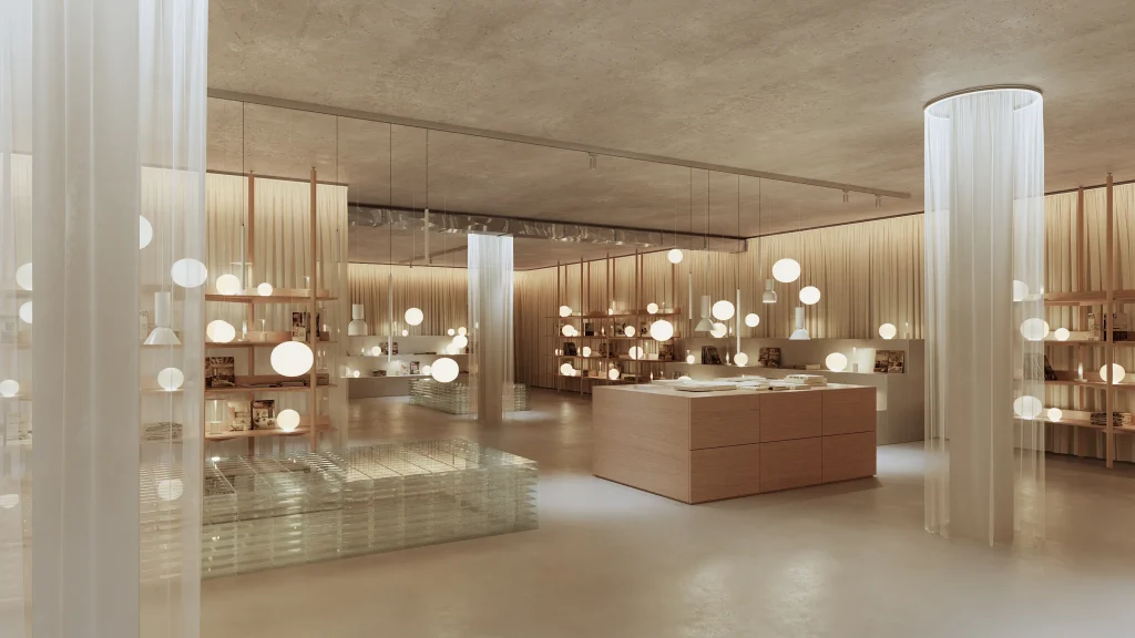
Cream interiors are all about light and softness, so they love good lighting. Reflective materials, surfaces and textures are not prohibited here. When choosing lighting fixtures for interiors in the natural style, you should pay attention to models of chandeliers, floor lamps, fixtures made of polished stone, chrome surfaces, and details made of brass. This way, half-tones can be accentuated, and excessive brightness can be avoided.
Different shades of cream are the colors of warmth and sunshine. The main thing is to emphasise the sophistication of the interior by using lighting of different wattages and shapes. This will require dividing the room into zones. Zoning with light is a well-known design trick that allows you to achieve the desired effect based on your goals.
For beige or cream interiors, chandeliers and lighting fixtures with simple shapes are predominantly used. Plant compositions, animal motifs and other natural features are welcome without affecting the mood and consistency of the interior.

Rules for the use of cream in the different styles
Classic style. Quiet, mellifluous tones look great in an environment of restraint and sophistication. Space is visually enlarged, details stand out, and light enters the room unobstructed. Different textures and varieties look excellent, such as cream and gold and cream and silver.
Country. A natural, simple style based on comfort and convenience, as if designed for a neutral color scheme. Here, the cream color combination for wall perfectly suits this style. Also, creamy shades are appropriate on the ceiling, decor and furniture. To deliberately emphasise the naturalness of the materials, the set of rough shapes is used, the effect of untreated surfaces, the carelessness of plastering etc. is welcomed.
Minimalism. Decor and furnishings in cream shades are suitable for any room size. Cool tones are more appropriate here, without extra variety. Emphasis is given to textures of materials, shapes, furniture and decorative elements.
Eclectic. A combination of absolutely disharmonious elements and details is appropriate. Cream in the interior will only accentuate the appeal and beauty of bright accents—ideal for background furnishings.
Naturalism. Combinations of natural colors (light green, blue, sand-brown, yellow), imitation of natural surfaces, and raw materials in decor and furniture are welcomed.
Provence. Plenty of warm, soft and natural shades, as the cream is the traditional tone of this style. Combinations of cream and natural wood and natural stone look good. The cream room color suits perfectly.