Best interior colour schemes for designing your home
The current trends in color schemes for a house’s interior
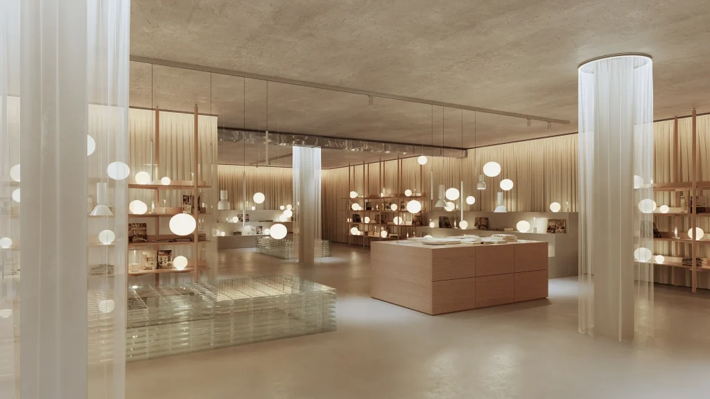
One current trend in home interior color schemes is neutral tones. Neutral tones such as whites, grays, and beiges are popular choices as they create a calm and timeless atmosphere. They provide a versatile backdrop that can be easily paired with other elements in the room, such as furniture and accessories.

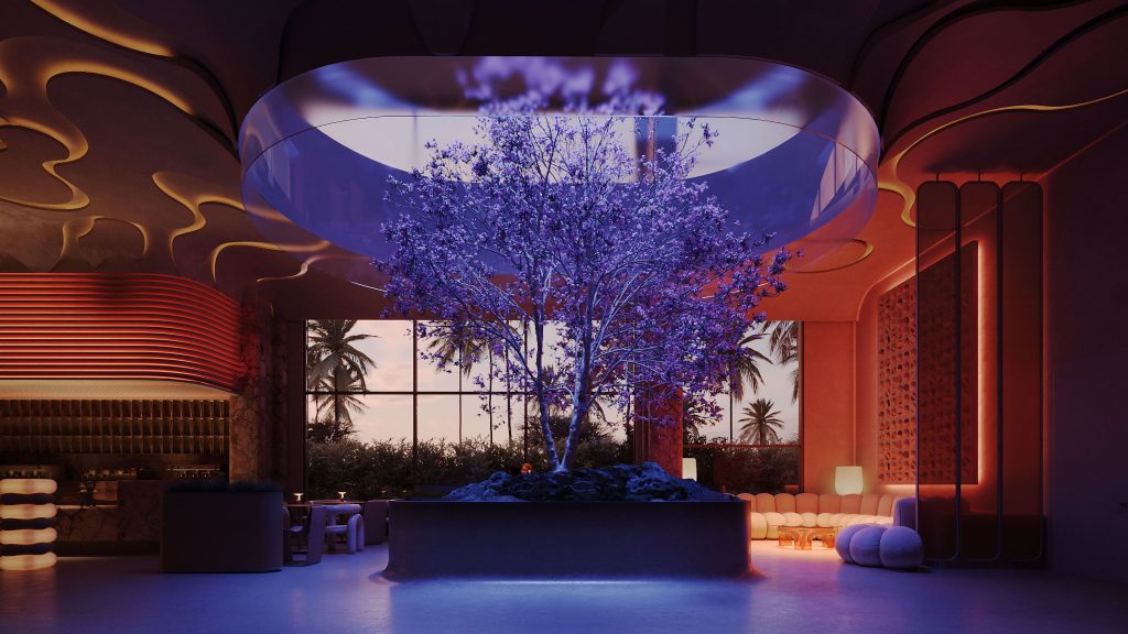
Another trend is the use of bold and vibrant shades. Designers increasingly incorporate rich hues like deep blues, emerald greens, and vibrant yellows into their color palettes interior design. They may add a sense of energy and personality to a space, creating a focal point and making a statement. They are often used as accents on walls, furniture, or accessories to create a striking contrast against a neutral backdrop.
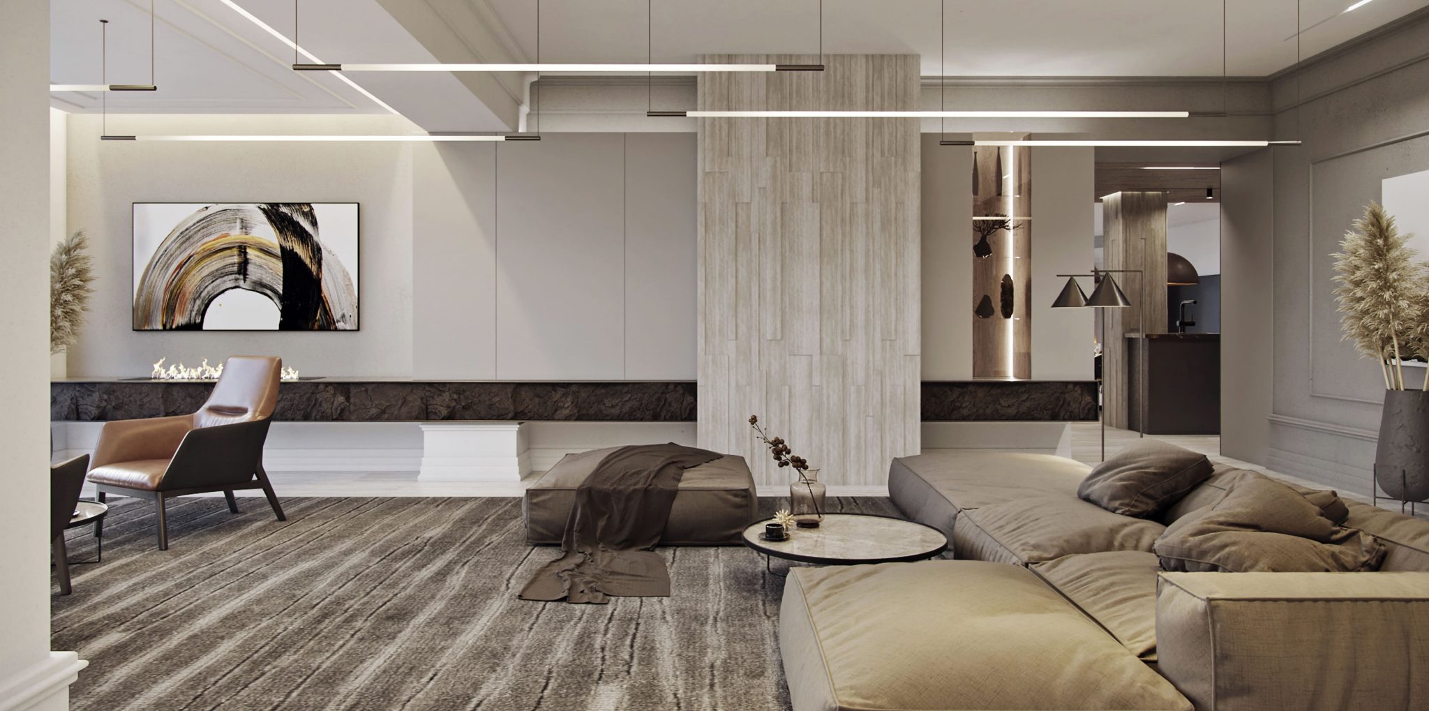
Earth tones are also a popular choice for interior design color schemes. Shades inspired by nature, such as warm browns, soft greens, and earthy oranges, can create a cozy and inviting atmosphere. They are often used in rustic or bohemian designs, where a connection to the natural world is desired. Earth tones can be paired with natural materials like wood and stone to enhance the organic feel of a space.

Monochromatic color schemes are another trend in interior design. This involves using different shades and tones of a single color throughout a room. For example, a monochromatic blue color scheme may include light blue walls, navy blue furniture, and sky blue accessories. These modern interior color schemes can make a space feel sophisticated and elegant while still allowing for variation and depth.
Lastly, pastel color schemes are gaining popularity in interior design. Soft and delicate tones like blush pink, mint green, and baby blue may create a gentle and soothing atmosphere. Pastel tones are often used in bedrooms and nurseries, as they evoke a sense of tranquility and serenity. They may be paired with white or light gray to create a fresh, airy feel or with other pastel shades for a more playful and whimsical look.
How different color schemes affect the overall mood
and atmosphere of a room
Different indoor color schemes can have a significant impact on the overall mood and atmosphere of a room. Colors have the power to evoke emotions and create a certain ambiance within a space. For example, warm shades such as reds, oranges, and yellows tend to create a cozy and energetic atmosphere. These interior color ideas can make a room feel more inviting and lively, perfect for social spaces like living rooms or dining areas.

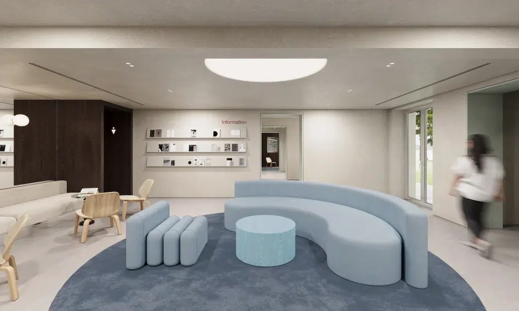
On the other hand, cool shades like blues, greens, and purples have a calming and soothing effect. They are often associated with tranquility and relaxation, making them ideal for bedrooms or spaces where you want to create a peaceful ambiance. Cool tones can also make a room feel more spacious and airy.
Neutral shades, such as whites, grays, and beiges, are versatile and timeless. They may create a sense of balance and harmony in a room, allowing other elements like furniture or artwork to stand out.
Bold and vibrant shades, like combinations of bright reds, blues, and yellows, can make a room feel energetic and lively. However, it’s important to use bold shades sparingly and balance them with neutral tones to avoid overwhelming the room.
Popular interior design color combinations
When it comes to interior design, there are several popular combinations that work well together. One classic combination is black and white. This timeless duo creates a sleek and sophisticated look and can be used in any room of the house.

Another popular combination is blue and white. This pairing evokes a sense of calm and tranquility, making it perfect for bedrooms or bathrooms.
Gray and yellow is also a trendy combination that adds a pop of color while still maintaining a neutral base. These are just a few examples of popular combinations that can transform your home design.
Green and brown bring a natural and earthy feel to a space. But if you’re looking for a bold and vibrant look, consider pairing red and orange together. These warm hues create a lively and energetic atmosphere. The key is to choose shades that complement each other and reflect your personal style.

Neutral shades like beige, gray, and white can be used as a base in your floor plan color schemes and paired with any other shade to create a balanced and versatile look. Feel free to experiment with different combinations and find what works best for your home.
Remember that lighting plays a crucial role in how colors appear in a space. Natural light can enhance certain colors, while artificial lighting can alter their appearance. It’s a good idea to test paint samples or fabric swatches in different lighting conditions before making a final decision. Additionally, consider the size and layout of the room. Dark colors can make a small room feel even smaller, while light may create a sense of openness and spaciousness.
Specific color schemes that enhance certain architectural styles
or design themes
In a modern or contemporary architectural style, neutral tones such as white, gray and black are usually used. They may be complemented with bold accents in primary colors like red, blue, or yellow to add visual interest and create a focal point in the space. This color scheme works well with clean lines and simple forms commonly found in modern architecture.
In contrast, a traditional architectural style often benefits when warm and earthy tones are incorporated. Colors like beige, cream, brown, and deep reds may help create a cozy and inviting atmosphere. They can be paired with rich wood finishes and ornate details to enhance the traditional aesthetic.
For a coastal or beach-inspired design theme, shades of blue, white, and sandy beige may evoke a sense of tranquility and relaxation. They mimic the hues of the ocean, sky, and sand, creating a serene and airy atmosphere. Adding touches of coral or turquoise as an accent may further enhance the coastal theme.

If you were wondering what the best interior color for house designed in an industrial style is, shades of gray, black, and metallic tones may help you achieve the best results and create a raw and edgy look. They can be paired with exposed brick, concrete, and metal finishes to enhance the industrial aesthetic.
Lastly, for a Scandinavian design theme, a color scheme that includes light and airy tones like whites, grays, and pastels may help create a bright and minimalist look. They can be paired with natural wood finishes and organic textures to enhance the Scandinavian aesthetic. Adding touches of black or navy as an accent can provide contrast and depth to the overall color scheme.