Balancing Colors and Textures in Interior Design
Understanding the Basics of Color and Texture in Interior Design
Delving into the broad spectrum of interior design, you’ll find color and texture playing a pivotal role. These two elements can utterly transform the overall feel of your space, conjuring everything from a warm, comforting vibe to a sleek, contemporary ambiance. The key is in knowing how to properly balance these aspects to achieve the desired effect.
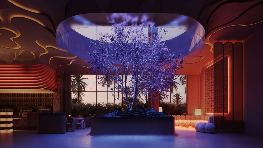
Color, in its most practical sense, will dictate the overall mood of the room. Cooler shades like blue and green often communicate tranquility, while warmer hues such as red and yellow exude a lively vitality. Textures, on the other hand, greatly impact how the space is perceived, adding depth and dimension. The smoothness of polished wood, for instance, offers a markedly different atmosphere compared to the rustic charm of exposed brick. By tactically employing colors and textures, you can manipulate the spatial aesthetics, crafting the room of your design dreams.
Exploring Different Color Palettes for Interior Design
With a myriad of hues available, defining a color palette for your interior design project can be both exciting and overwhelming. As you embark on this colorful journey, remember that the goal of a color palette isn’t simply being about pretty. It should also create a specific atmosphere, stir emotions, and align with your personality and lifestyle.
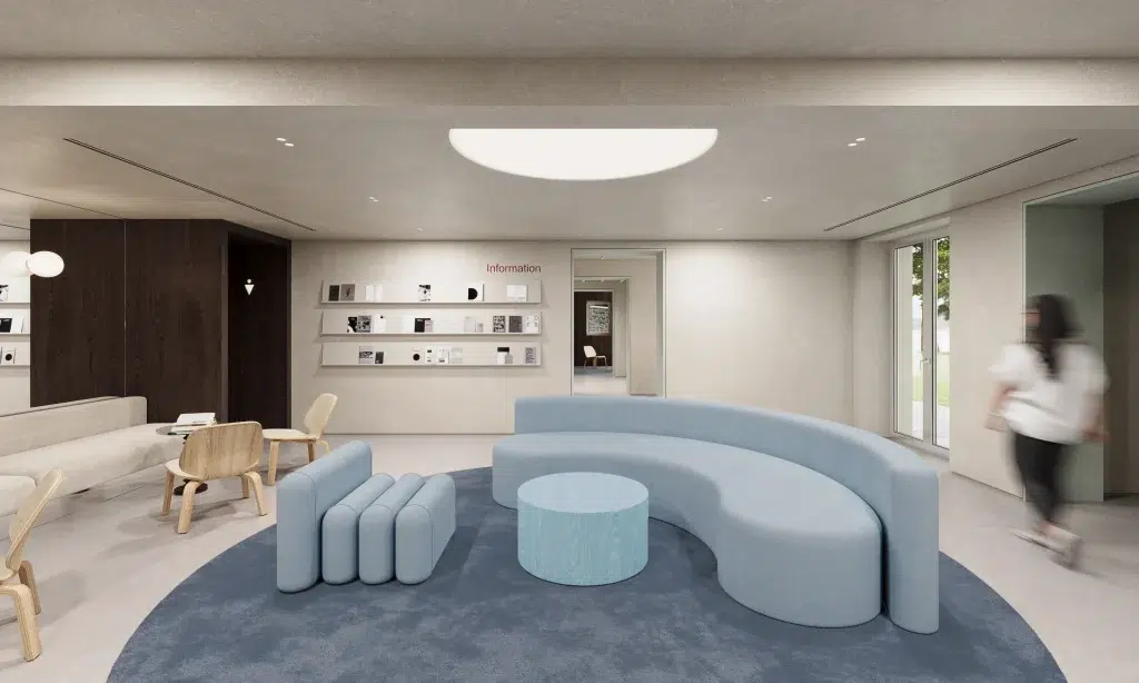
Neutrals like whites, greys, and beiges provide a versatile backdrop, allowing the space and your chosen pieces to shine while harmonizing color schemes. On the other hand, bold, rich colors like royal blue, deep red, or emerald may create stylish drama and depth. Pastels, such as mint green and blush pink, add a soft, soothing touch, whereas earthy tones, like terracotta and olive green, add warmth and bring a touch of nature indoors.
Remember, you’re not limited to one type of palette. A combination of discrete color and texture can provide a layered, refined look. So, have fun mixing and matching! As you experiment, consider color balance and visual harmony in interiors. Cooler hues communicate calmness and tranquility, while warmer ones spark energy and passion. This careful consideration of interior design colors ensures a cohesive and visually pleasing space.
Achieving the perfect balance requires an understanding of color theory, but don’t worry if you’re a beginner. Starting with a basic monochromatic or analogous color scheme may be the perfect path to finding your ideal palette and exploring various interior design palettes. Remember, this is a journey, one that’s meant to express you, so take your time. Every choice you make will contribute to the feel and ambiance of your space, transforming it into a place you love.

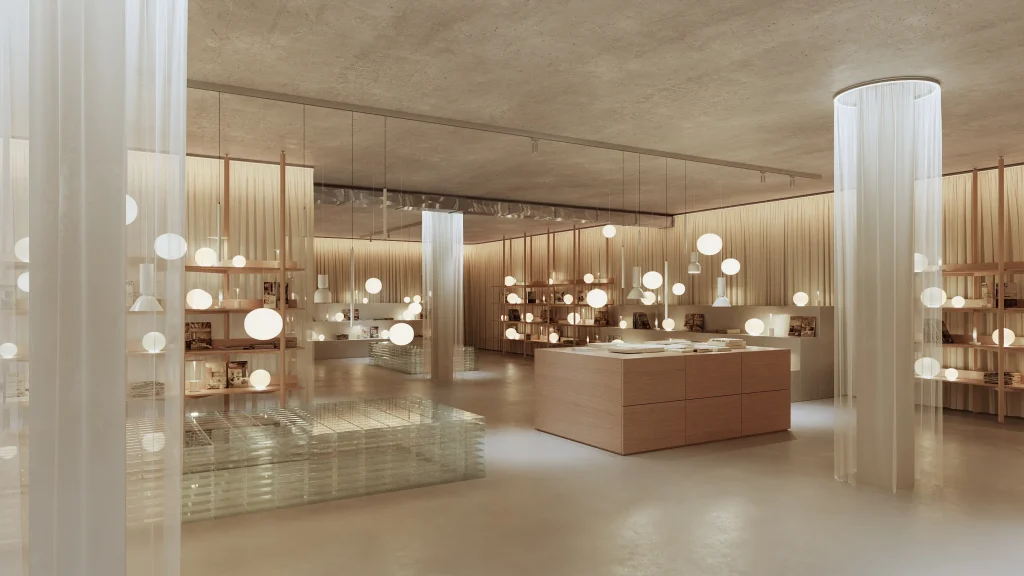
The Impact of Texture on a Room’s Ambience
We often underestimate the role of texture selection in design and how it affects the atmosphere of a room, especially in relation to color. It’s true that colors set the tone, but the textures deepen the story, evoking certain emotions in the observers. For example, imagine a room with the same color scheme – soft pastels or invigorating primary tones. When the primary tones are utilized in a smooth, glossy finish texture, it elicits a different feeling compared with the same color palette used with a rough, rustic texture.
Textures portray a visual weight in a space, influencing how the area looks and feels. A room with lots of rough textures like wool, jute, or reclaimed wood feels more grounded and usually homier than a sleek room infused with marble, silk, or polished metal. The former gives off a rustic, inviting feel, while the latter can come across as chic and sophisticated. Understanding the interplay of different textures and incorporating texture layering in design can further enhance the ambiance and character of your space.
Always remember that texture introductions don’t need to be dramatic. Subtle changes can lead to textural contrast and create visual interest. For instance, pairing rough-texture upholstery with slick wood furniture can break monotony and breathe life into the room.
To master the art of interior design, one must not overlook texture. By carefully considering textures in your design strategy, including styling with contrasting textures, you can not only enhance the depth and dimension of your room but also build a more immersive and sensory experience for everyone who enters.

Creating a Cohesive Color and Texture Scheme
Getting your colors and textures to work together is all about visual weight. The trick lies in leveraging the architectural details of the room and using decorative elements to balance and enhance their visual appeal, ensuring texture balance in decor. Bold colors might draw your attention, but if balanced with subtle or contrasting textures, they can add depth and avoid becoming overwhelming. Similarly, if you prefer to work with a palette of neutral colors, introducing an array of textures such as plush fabrics, brick walls, or wooden flooring can keep the space from feeling flat or bland.
Another integral aspect of this design approach is called ‘layering’. This technique involves building up your design by gradually incorporating colors and textures that complement each other. Starting with a base color and texture, then layering on additional hues and tactile components, allows you to slowly build a rich, complex, yet harmonious interior. Whether you’re piling high-textured throws on a leather drogue chair, creating a gallery wall of matching and contrasting art pieces, or simply adorning your walls with colorful tapestry, remember, experimentation is key. Embrace a bit of courage and creativity; you’ll quickly master the fine art of balancing colors and textures in your very own space.

Common Pitfalls to Avoid When Balancing Colors and Textures
Evading common pitfalls when arranging colors and textures can be a bit of a high-wire balancing act. One significant error often made is the apathetic use of color and texture, meaning too much of one thing and not enough of the other. Remember, balance doesn’t necessarily mean evenly distributed. Your goal should be harmony, which might mean more dark hues and less light, or more smooth surfaces and fewer rough ones. It’s all contextual to your space and the atmosphere you’re hoping to achieve.
Avoid being overly matchy-matchy. This isn’t to say you can’t use the same color or texture more than once; repetition can be a powerful design tool that creates a sense of unity. However, too much sameness can make the interior lifeless and flat. Try to mix and blend, use contrast to create interesting visual tensions, and add unexpected elements to catch the eye. Fear not to deviate from the norm. Remember, your space should amplify your personality, not mimic a showroom.
Lastly, don’t let fear stop you from trying bold combinations. Often, fear of mistakes leads us to stick to the safe zone—the ubiquitous beige paint, the default white tiles, or the plain, smooth walls. However, allowing your creative juices to flow, testing different shades, and experimenting with mixed and matched textures might lead you to stunningly unexpected results.

The Power of Accent Colors and Textures
Let me introduce you to the extraordinary power of accent colors and textures. These spectacular elements, often used sparingly or strategically, can dramatically transform a room and enhance its aesthetic appeal. An accent color could be a vibrant throw pillow amid a sea of neutrals or a brightly painted wall in an otherwise muted room. Similarly, an accent texture might be a plush rug on a hardwood floor or a velvet chair amid more understated furniture.
One way to effectively wield the power of accents is by using them to reinforce your color scheme, leveraging the principles of color theory in home decor. For instance, if your room features mainly cool hues, a vibrant blue vase or teal throw could provide the perfect splash of reinforcement without overpowering the room. Similarly with textures, if your room is dominated by sleek, glossy finishes, tossing in a bit of velvet or faux fur can add a surprising yet fitting touch of softness. Importantly, always remember the power they wield is strong, and so they require careful thought and consideration. Too many accents can create visual clutter, and too few can leave a room feeling unfinished.
Additionally, don’t forget that accent colors and textures can serve practical purposes too. A well-placed accent can dictate the focal points of your room. A boldly colored couch, for instance, could serve as a centerpiece for your living room, while an intricately textured wall could dramatically anchor a bedroom. The magic of accent colors and textures is their ability to complement, contrast, and tie everything together.