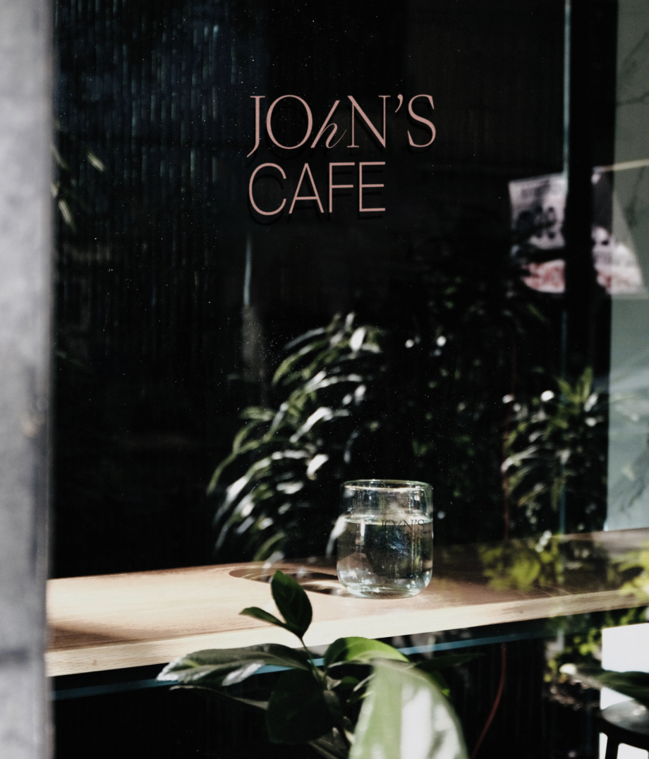
JOHN’S HOTEL BRANDING
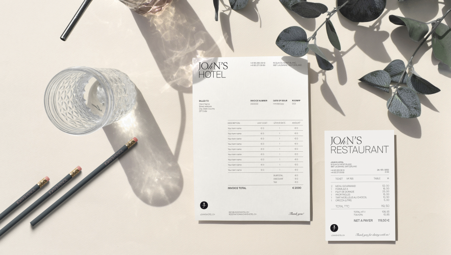
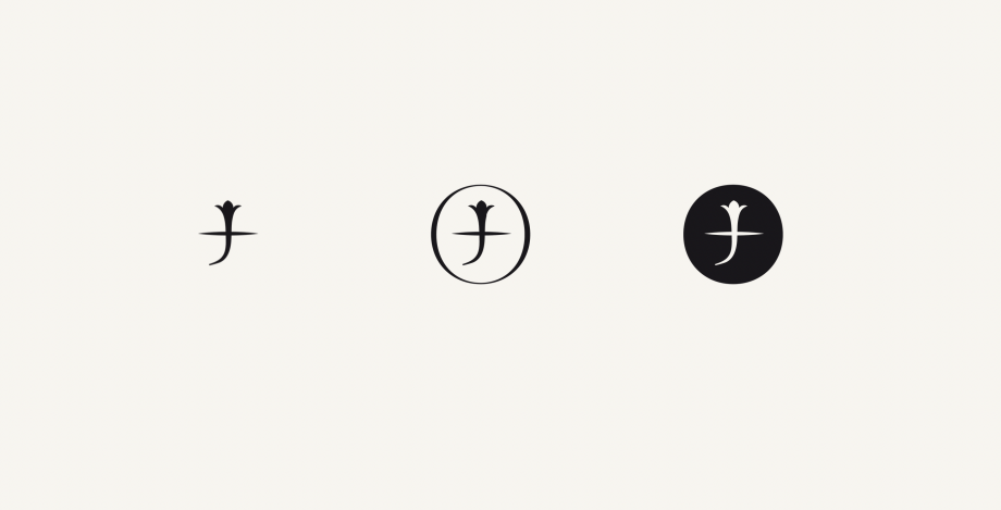
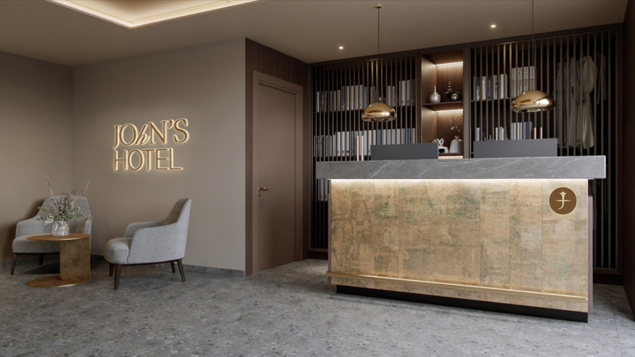
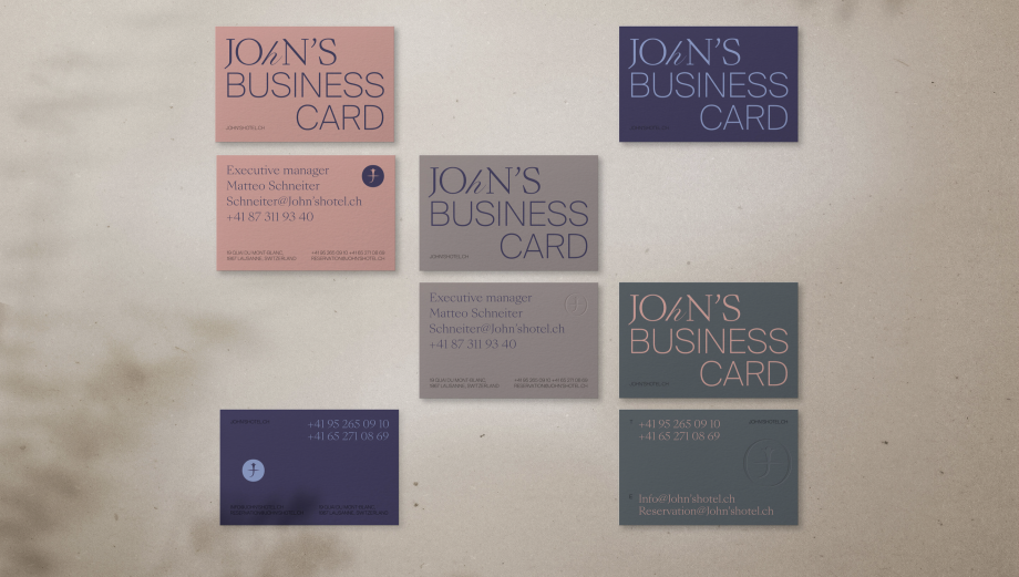
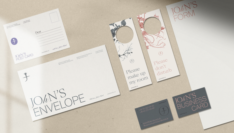
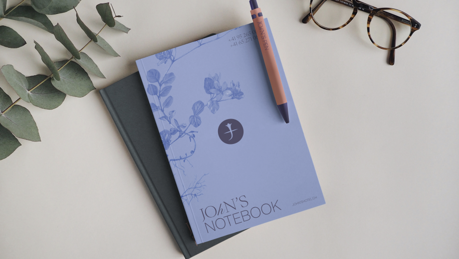
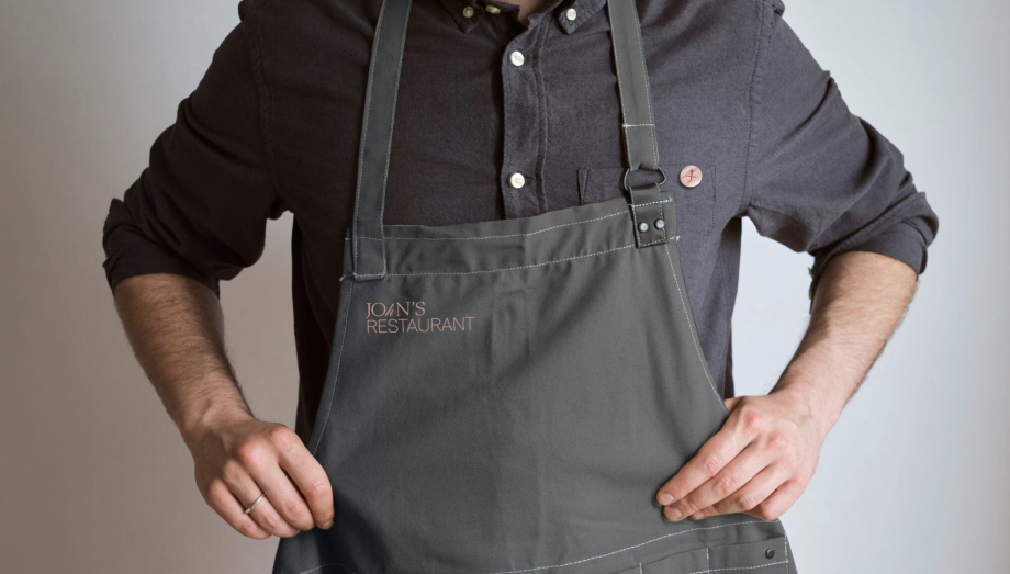
The visual language of John's Hotel is built on the importance of family heritage and family values.John's Hotel logo is based on a mixture of 3 typographic traditions - Serif, Sans Serif and Calligraphic. Thus we visually convey heritage, modern approach and add a personal touch.John's logomark is a blend of several symbolls which draw inspiration in the brand's philosophy. You can see here a J letter - the initial letter for the brand's title, stylized as a flower which is growing through the surface of the ground. Very important to note that we depict the flower with it's root because roots are the core of the brand's values.