GRATA ECO HOUSE
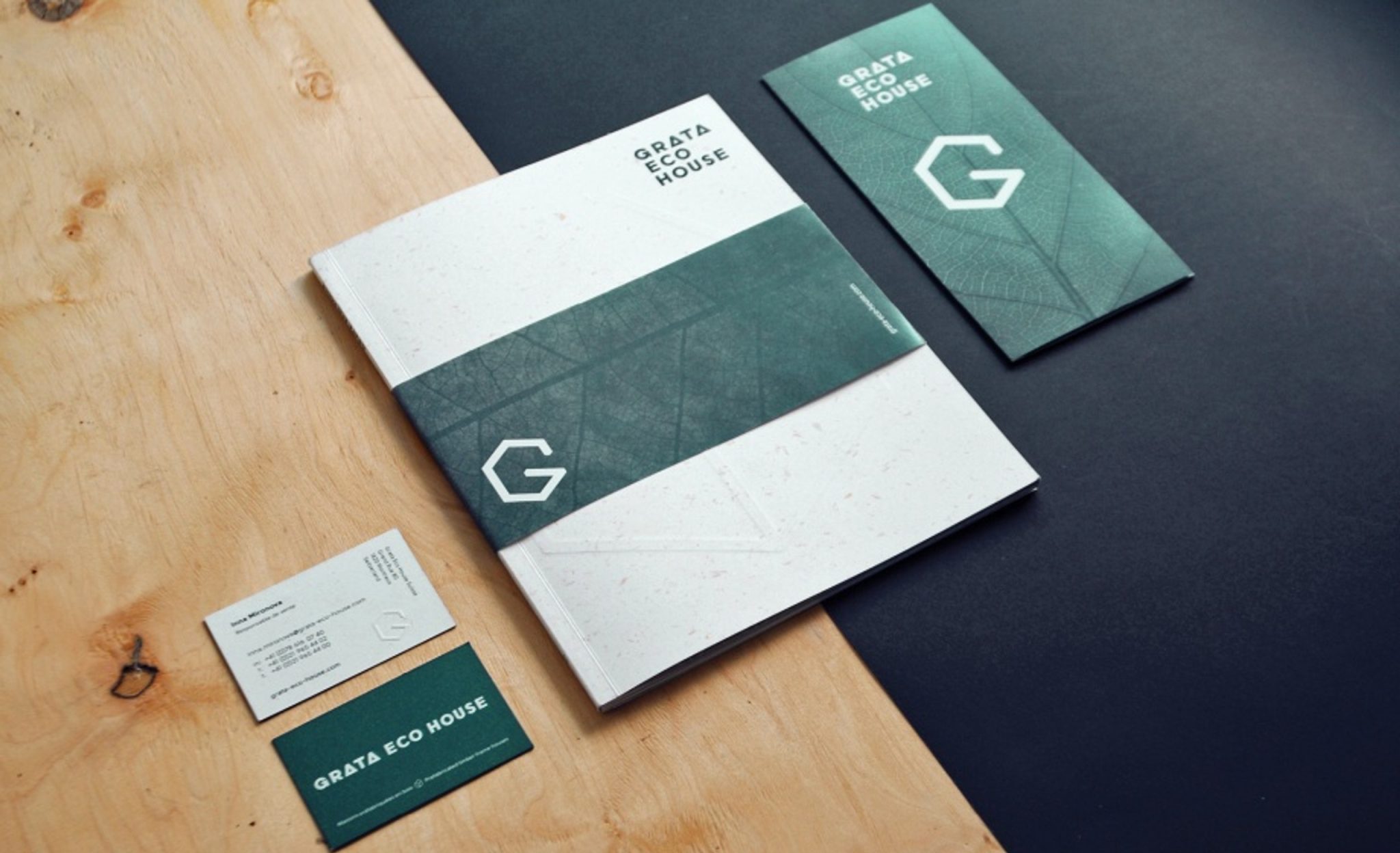
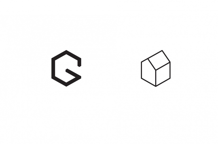
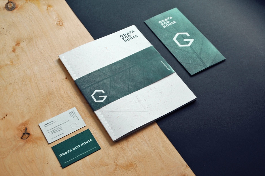
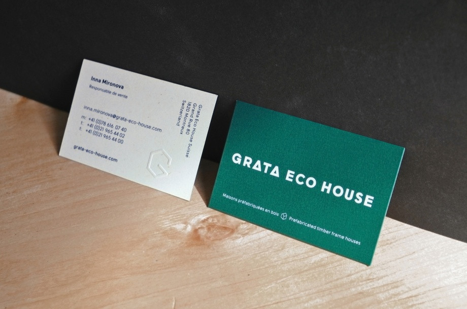
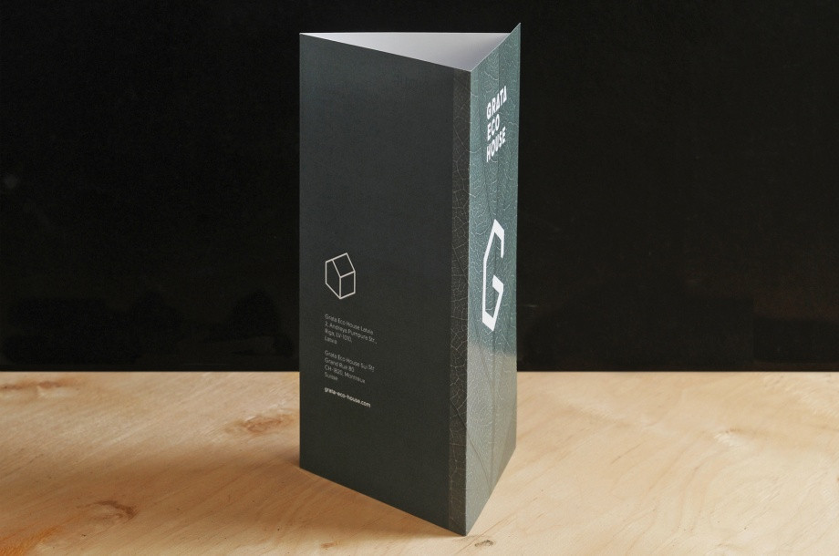
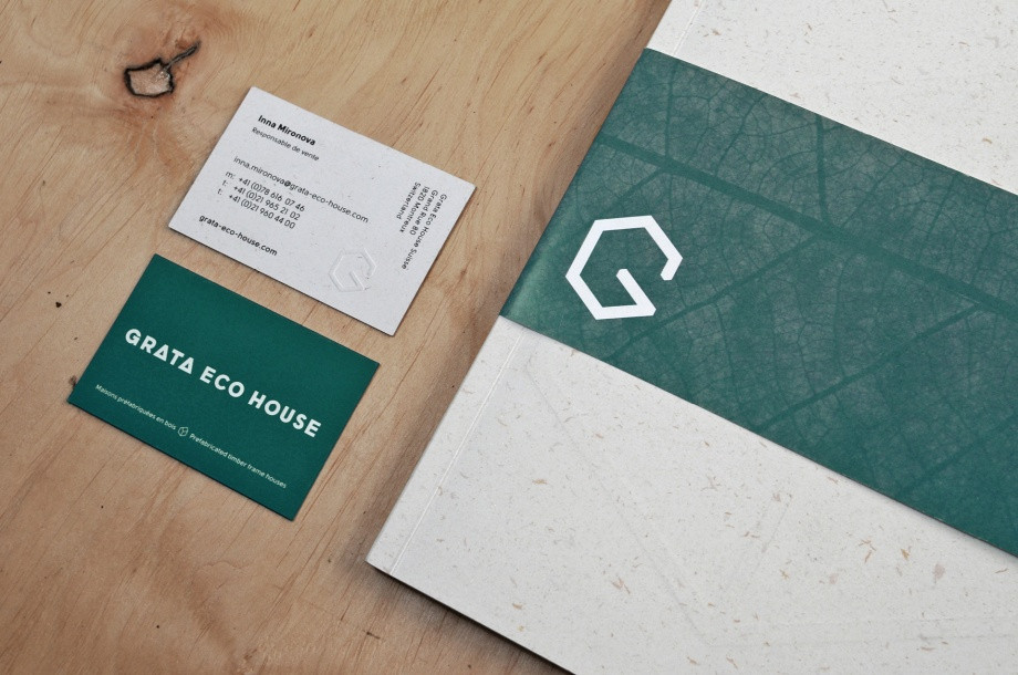
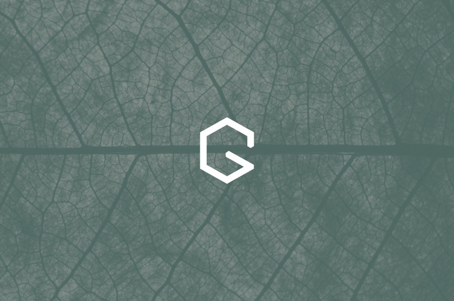
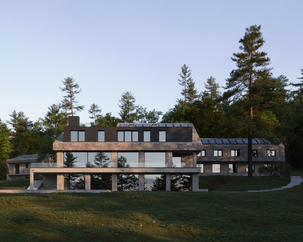
When creating the identity of Grata Eco House Suisse, we were inspired by the image of a house of simple and strict geometric forms standing on a hill in a wild and beautiful natural landscape. Key associations of the identity GRATA ECO HOUSE - reliability, manufacturability, naturalness and environmental friendliness. All of them are reflected in the company logo. The font is built on the basis of classical proportions in the modernist tradition : solid, reliable, stable. In the word GRATA the ecological compatibility and the form of the house are already coded. The letter G, stylized as a sign of recycling arrows, symbolizes an eco-friendly approach to the work of the company. The letter is stable and reliable, like a good house. The sign contains the letter G and an isometric image of the house. The image carries a strong clarity and internal dynamics.

