BE-CAMPS BRANDING
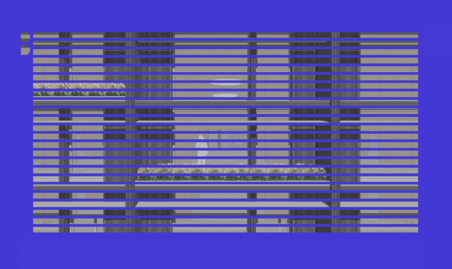
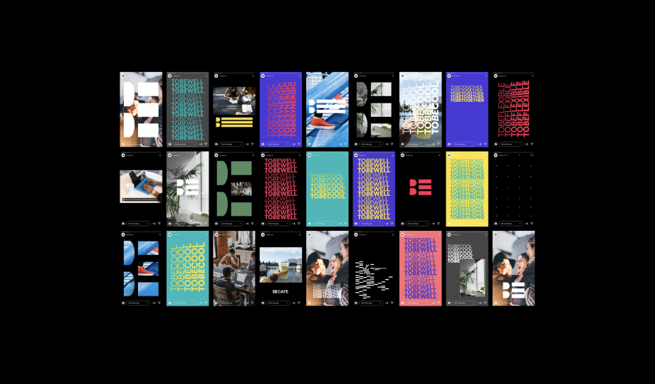
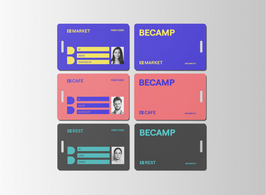
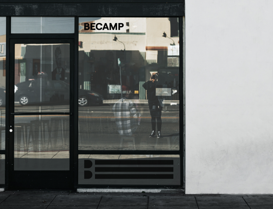
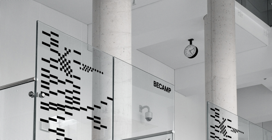
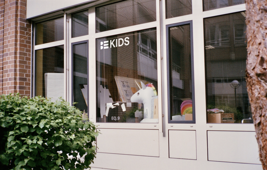
BECAMP wordmark set in bold uppercase font stands for easygoing, uncomplicated upproach of the brand. Legible and friendly typeface called Matter is used for this logo as well as for the whole system of visual communication here.BECAMP icon consist of two stylized letters which compose the word BE. The icon is a central element of the visual identity system. It's core. "Being" supposed also to be the central definition of the whole philosophy of the brand as facility possesses everything needed for work\life balance of it's residents.Plus pattern resembles plus column structure used by architects in their project for BECAMP and it also reflects the idea of comfortable coworking space.
